Using Gestalt Theory in Logo Design
For the past few years, leading brands and companies have been redesigning their logos for a much-needed upgrade.
However, most people don't realize the amount of time designers and artists dedicate to the process of conceptualizing a logo.
Logo designers often utilize the Gestalt Theory in the logos creation process.
The Gestalt Theory was the brainchild of a group of German psychologists back in the 1920s.
They developed theories about how people perceive the images they see around them and coined the term Gestalt principles.
What are the Gestalt principles, and how do companies and brands use them?
First Principle: Focal Point
The focal point principle states that whatever stands out visually will capture and hold the viewer’s attention first.
There are many different ways to create this emphasis or focal point such as through lines, colors, shapes, textures, size, etc.
Second Principle: Proximity
The human brain tends to believe that when different elements are placed close together, they form a particular image.
For example, when you pass by a schoolyard or even a school bus, and you see a group of students, you may think that they are classmates or, at the very least, schoolmates.
The brain immediately creates an association when particular objects are grouped together.
When it comes to the principle of proximity, location plays an integral role in the way an image is perceived.
On the contrary, when objects have considerable distance between them, it will also mean that these objects are unrelated or have no relation.
When it comes to employing the intricacies of the proximity principle, no one could possibly have done it better than the Uniliver company.
More often than not, consumers might have dismissed the logo of the company as a letter U at the back of their favorite products.
However, what is more intriguing about this logo is how it was able to incorporate the other logos of brands under their company.
Third Principle: Common fate
The principle of common fate was not included in the Gestalt theory originally; however, its importance is undeniable.
When people see a group of objects or even animals, they have the tendency to see them moving together.
This is commonly seen whenever a person goes diving and encounters a school of fish.
The brain is wired to believe and see singular objects grouped and moving together as a singular stimulus.
One good example is the golf logo of the Spartan golf club which includes a man who just hit the golf ball.
The logo was designed with multiple trapezoids that seem to create the movement of a putter as the golfer hit the ball.
This could also be effective for electronic advertisements where they can truly utilize animation to optimize this principle.
Fourth Principle: Continuity
There is always something truly captivating with the quiet beauty that rivers and oceans possess.
These bodies of water are known for the simplicity and sophistication rolled into one because of their ability to create a continuous flow.
Just like in perception and design, people recognize flow through continuity.
The principle of continuity deals with the way certain elements are aligned.
Typically, most brands follow a straight line whenever they get their brand names printed.
But not the leading drinking beverage all over the world, Coca-Cola.
For the past decades, Coca-Cola has used the same logo, and it continues to be on the top spot when it comes to beverage super brands.
Perhaps the only change they truly made was their color choices.
If people would look closely at this beverage brand's logo, they are using cursive but what's different is the way letters were aligned.
As you look closely, there seems to be a subtle wave that almost seems like the words are moving the longer you look at it.
Not only was it intriguing, but truly recognizable from the shelves of grocery stores.

Fifth Principle: Symmetry and Order
Prägnanz or more commonly known as the principle of Symmetry and Order originated from the German language which meant, "good figure."
This particular principle allows your brain to simplify an image to something more understandable.
One of the best examples of this Gestalt principle is the fine ring Olympic logo.
To the untrained eyes, it can simply seem like a series of curved lines.
However, the brain is designed to help humans perceive the world in a simpler way, making humans see five circles overlapping.

Sixth Principle: Similarity
Similarity breeds familiarity.
Whenever you see two people who look similar, you will most probably assume that they are related.
Sometimes it could be a mother and her daughter or, even better, twins.
Typically, the brain is designed to believe that when two things look similar, they are related.
When objects are related, they eventually create a singular image that makes sense.
Take, for example, the logo used by the broadcasting television company NBC.
At first glance, it may just seem like an array of colors.
Then the longer you look, it would start looking like a flower.
After examining the logo even further, there can even be a semblance of a peacock with a small white triangle detail found on the purple feather of the supposed bird.

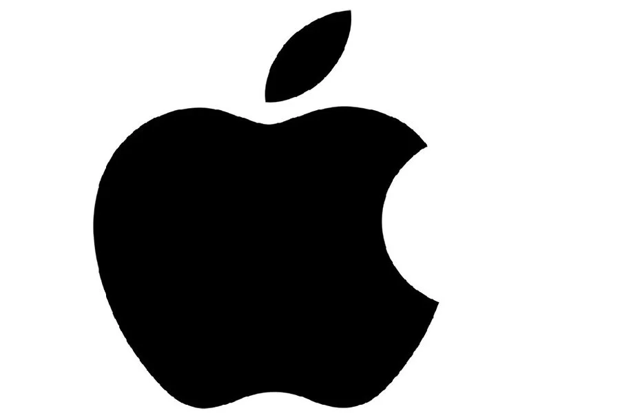
Seventh Principle: Figure/ Ground
In any art form, including logo designing, two things make up an art piece: positive and negative spaces.
Logo designers utilize these two elements to create some visual hierarchy that plays together with the principle of closure.
In this Gestalt principle, what is often considered unimportant now plays a vital role in how people perceive an image.
An images' background typically serves as dead space, however, with this principle it almost feels like the design bleeds out to the background, therefore, creating a singular image.
Perhaps one of the most familiar examples of this principle is the Apple logo with that singular bite mark.
From its earlier designs that utilized a rainbow-colored apple, the company has continuously evolved and redesigned its logo until it reached it is most familiar apple out there.
There is also the logo by the World Wide Fund for Nature.
It may seem like random black spots on a white canvas, but the more people look at it, they will make out the image of a panda.
These companies showed how their brand logos are not merely an image that represents them. Instead, it was a well-thought-out idea that goes beyond any expectation to be able to withstand the test of time.
Of course, some were odd, but like what Alfred Hitchcock once said, "Ideas come from everything," even if it was based on an animal or even a fruit.
How to apply Gestalt Principles?
Now that we've discussed the Gestalt Principles and how some of the leading brands had used these schools of psychology to their advantage.
It is now time to understand what it entails to harness the power of Gestalt principles in creating your business logo.
Company Name
When a logo designer creates a logo, they must first and foremost study the company name or brand.
The company name alone can give a lot of ideas to a designer.
For example, the company is named after an animal, like Dove.
So the company created a logo that resembled the silhouette of a Dove, and if you even look closer and turn the dove, you might even see a letter D.

Company Product
Next to the brand name, a logo designer can draw inspiration from the company's products.
A logo can be designed using the principles of Proximity, Continuity, and Similarity to create an image out of words.
Take, for example, the work of Burger King logo designers.
They created a logo that utilized their brand name to serve as the meat in their logo. To this day, they continue to use the same style with a few alterations over the years.
Company's Special Offers
A company's name or even product can be a good motivator for any logo designer, but it may be difficult for some.
Some brands utilize their logo to hide fun surprises from their customers.
Perhaps you are a coffee shop that offers specific types of coffee that can only be harvested in a particular place in the world.
It could be something to consider incorporating.
One ice cream shop called Baskin Robbins use their logo to hide a fun fact to their customers.
Known for the assortment of ice cream flavors they offer.
Their logo reveals that they have a total of 31 ice cream flavors to offer.
Company Services
The services offered from one company to another may vary from another.
Some may have additional perks as opposed to others.
What's great about a company logo is how creative it can be. A logo designer can play with words and utilize how it is designed to hint at how a company operates.
For example, a delivery company called FedEx employed subtlety in the most creative way there is.
The company had shown that they move things around simply with the use of an arrow strategically placed in between the negative space of E and x.
A company logo is more than just an icon or an image that presents a company.
In fact, a simple image usually placed in every company packaging can go so far in showing clients what they can offer.
A reminder to all logo designers out there from one of Greece's greatest philosophers,
Aristotle, "The whole is greater than the sum of the parts."