Top 101 most famous logos of all time ranked and what you can learn from them
The significance and importance of a brand’s logo can’t be ignored. You will see their logo everywhere, from their website, social media activity and printed collateral to advertising.
There are thousands of organisations throughout the world with famous logos. These vary from many different industries including fashion, food, health, technology and sports to name just a few.
This list gives a brief background of the top 101 most famous logos in the world. Scroll to the end to find out the top-ranked logo of all time. There is also the option to give feedback on what is your favourite iconic logo of all time at the end.
Here is a list of the top 101 most famous logos of all time:
101. Bic
BIC is a leader in stationery, lighters and shavers business. One of the oldest logos on the list, it consists of a guy with a ballpoint pen ball as a head has been the logo used by Bic for more than half a century.
100. Vans
The current Vans logo has been used since 2016. Most people probably recognise the older logo which consisted of Vans logo as purely typographic without the “Off the Wall”.

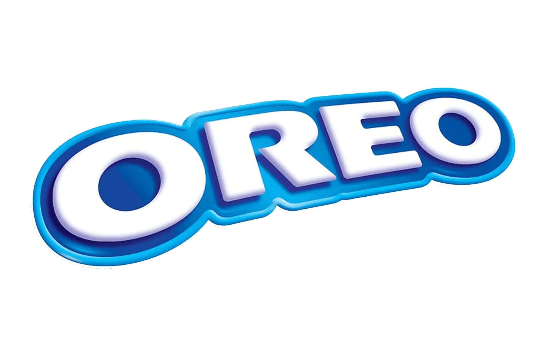
99. Oreo
Oreo is the worlds most famous brand of chocolate cookies. Oreo which launched in 1912, is one of the world’s most popular cookie labels and the best-selling one in the USA.
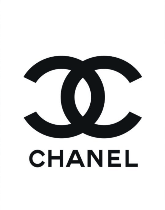
98. Channel
One of the most famous fashion logos in the world, this famous brand dates back to Paris in 1910 when Gabrielle “Coco” Chanel created the brand.
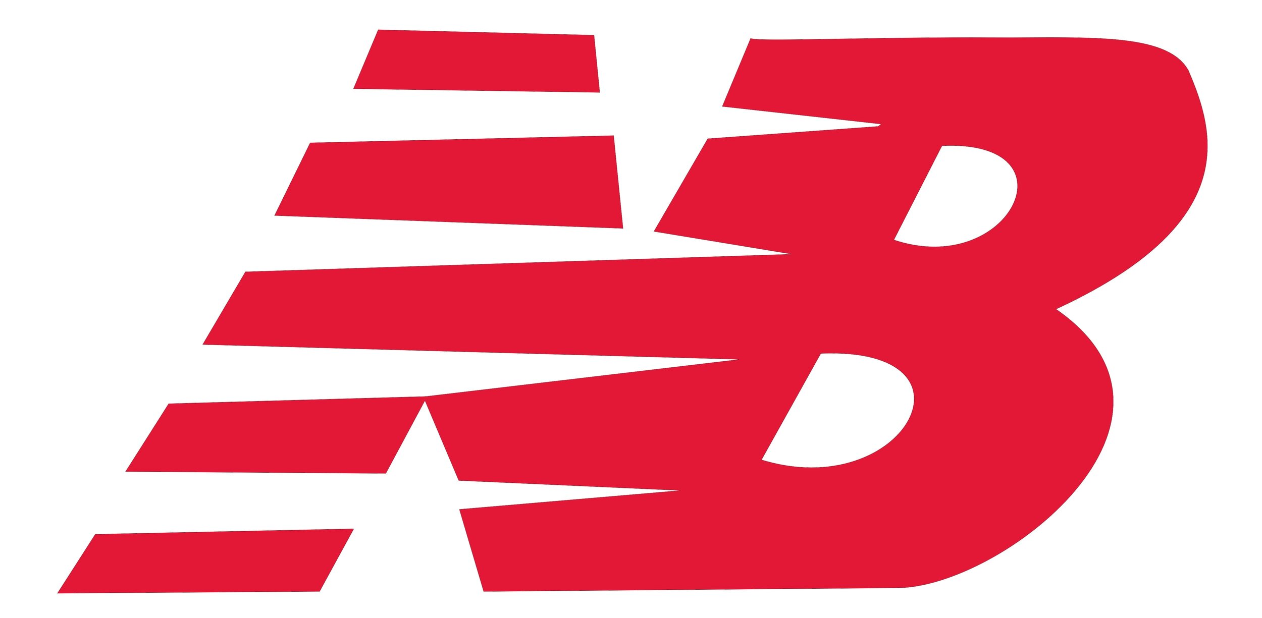
97. New Balance
This famous sports logo has held onto its basic structure, shape, and appearance for almost half a century.
96. TikTok
Only around since 2016, this logo hasn’t changed that much in this time. This video sharing company looks like they aren’t going to lose popularity over the next few years.
95. MTV
MTV was launched in 1981 and since then, it has been entertaining fans across the world with the latest and greatest in music and videos. The logo design has a large `M` with smaller `TV` positioned at the right corner at the bottom of the letter `M`. The words `Music Television` comes beneath.
94. Dove
The symbol and its colour depict harmony, peace, joy, and prosperity, which forms the company’s mission.
93. Cisco
The name Cisco comes from the latter section of the name San Francisco. It is the home to the Golden Gate Bridge, a source of inspiration for the company’s logo. The logo is light blue, with vertical lines of varying lengths, which reflect the shape and strength of the golden gate bridge design.

92. Steelcase
Steelcase is a company dealing with a range of architecture, furniture, and technology products and services that are designed to help people reach their full potential. The company’s logo is easy to recognize as it’s the company’s name, `Steelcase`. The name and its brand were as a result of an advertising campaign in promoting metal office furniture over wooden ones.

91. Kampgrounds Of America
Campgrounds of America also known as KOA is a company offering campground services that were founded in 1962. The company’s logo the word KOA and beneath it is KAMPGROUNDS, all in black. Slightly above the letter O in KOA is a triangular-shaped object, perhaps representing a tent. All the wordings are against a thick yellow background.

90. Jack in the Box
The company has redesigned its brand logos to a 3D stylization. However, the new logo is criticized to be closer to video game products than burgers. The word `jack` is inside the cube while `in the box` is beneath the cube, all in red color except `jack` which is white but in a red cube.

89. Hershey’s
This company is known for milk chocolate bars and other confectionery brands, including the popular KitKat. It unveiled a refreshed corporate visual identity which was a move away from its original 3D styling to a flat design bearing its name `HERSHEY` and beneath it are the words ` THE HERSHEY COMPANY`.

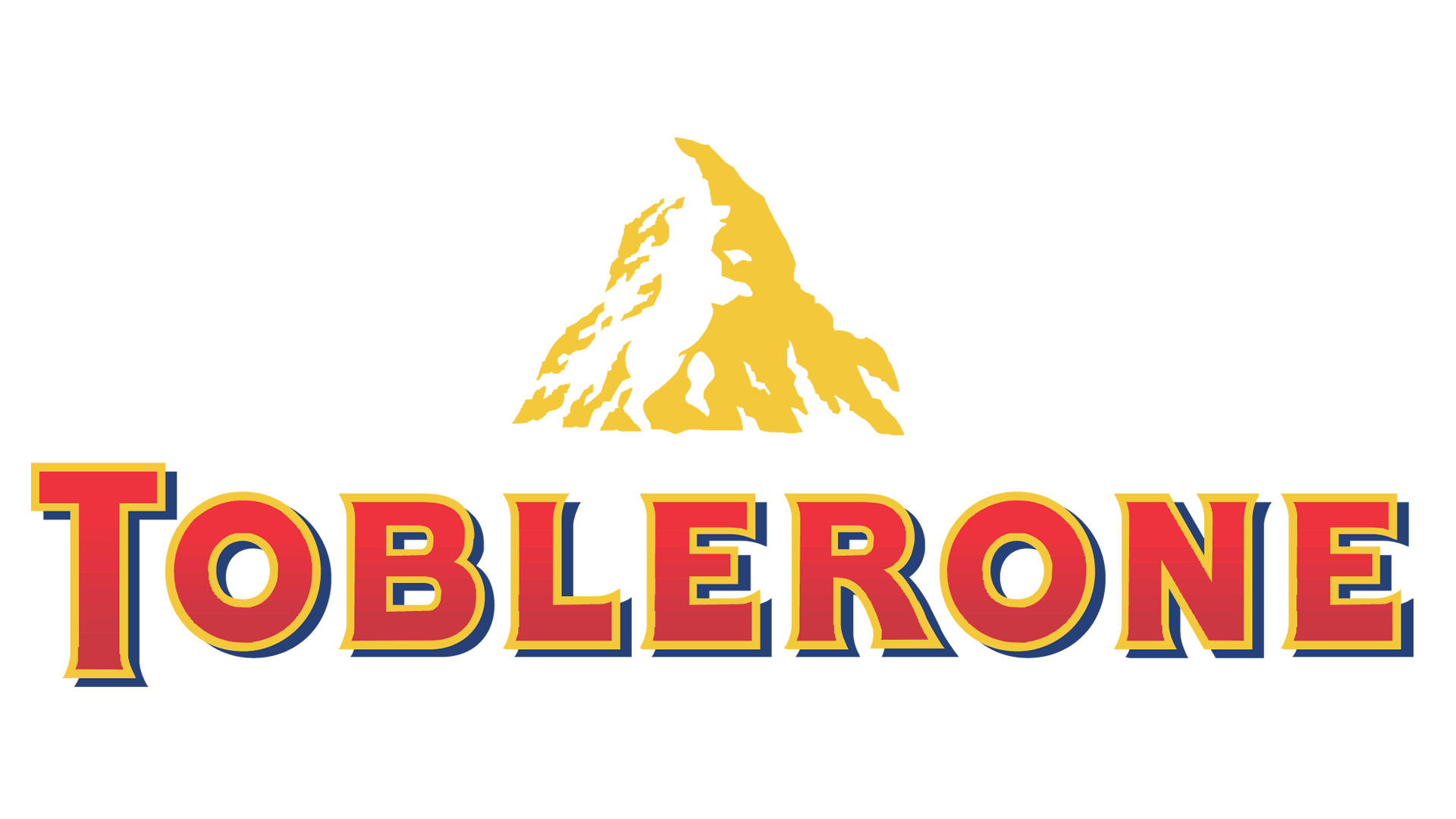
88. Toblerone
This logo has a hidden bear that comes from the location of its first manufacturing unit. The logo has a picture of a mountain and the word `Toblerone`.
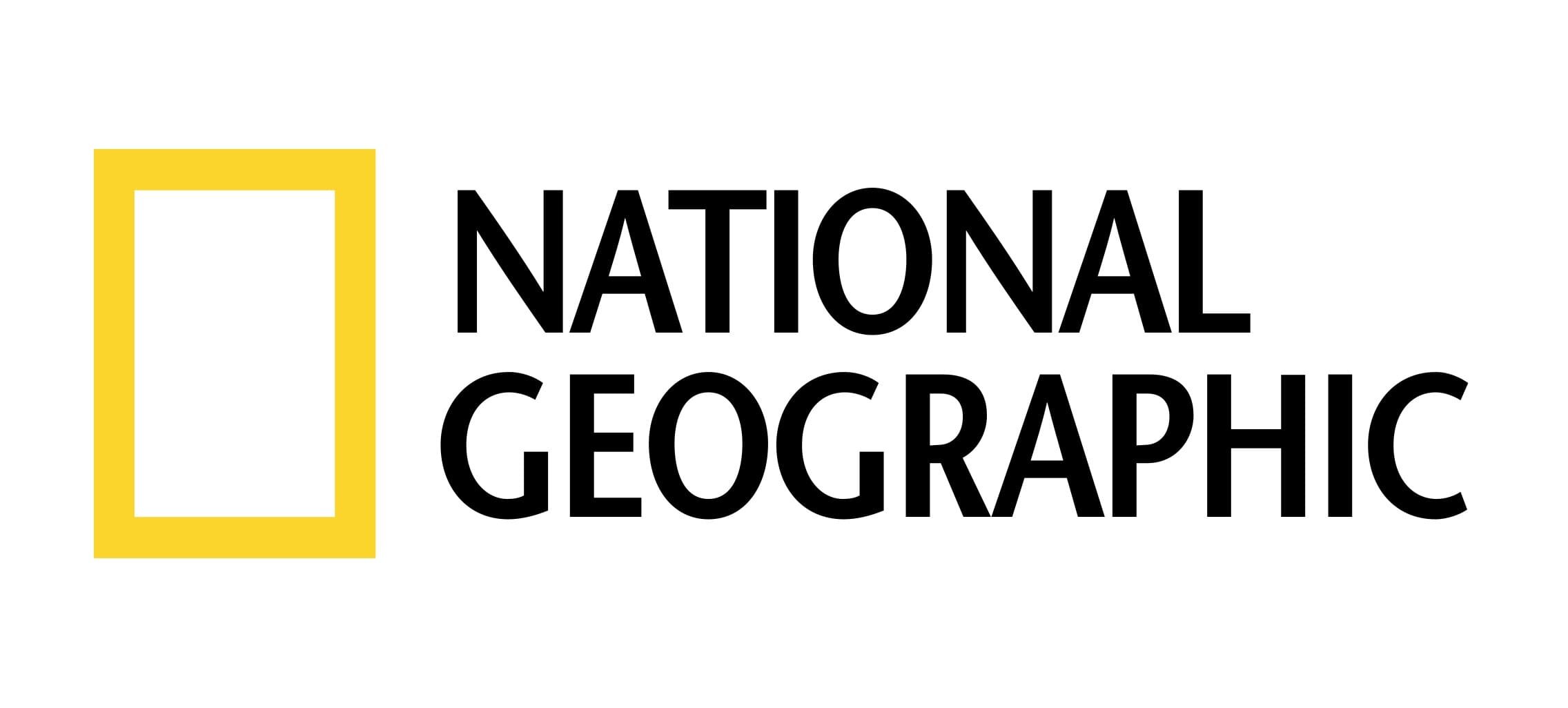
87. National Geographic
This logo has a rectangular box in bright yellow. Besides it is the text ` National Geographic` in a characteristic sans serif, in capital letters typeface.
86. Petro China
The logo features a CNPC emblem with a nameplate beyond it. Above the wordmark is a rounded two-coloured symbol, which resembles a flower with 6 petals in the upper part and a big solid red lower part.
85. Xiaomi
This Chinese tech company logo reflects its ambition and interest when it comes to innovations. The logo features a stylized letters `MI` in white in an orange rectangular with round corners.
84. Pizza Hut
This current logo was initially designed in 1974. It has black smooth lettering which is beneath a strict and sharp red hat.
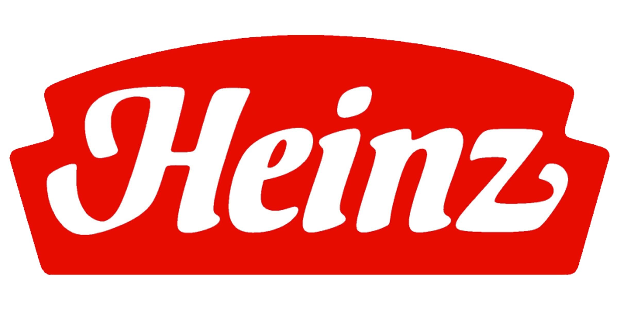
83. Heinz
The company was founded in 1869 and is the world’s oldest and biggest food processing company. The logo entails an elegant title case inscription with its white letters on a scarlet red banner with an arched top and geometric bottom parts.
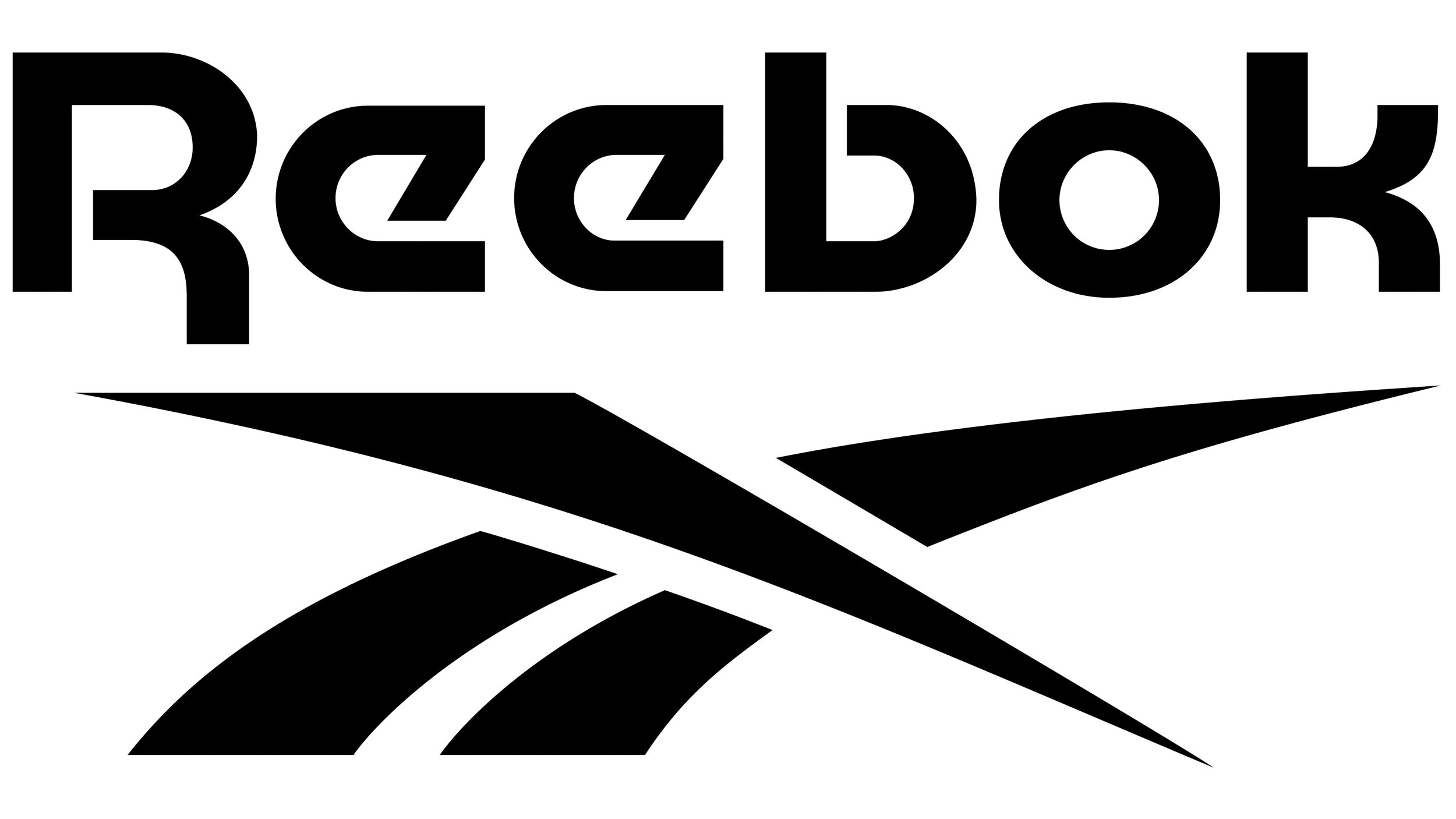
82. Reebok
Established in 1895, this company has become one of the oldest sportswear brands across the globe. The logo has undergone numerous changes, but still to date, uses a symbol inspired by the British Flag. The fonts in the word Reebok are sans serif and look clean and minimalistic.
81. Land Rover
The oval shape of the logo is speculated to have been inspired by a tin of fish, which the designer Maurice Wilks was eating at the time. The green colour may symbolize nature and the vehicle's ability on off-road terrain.
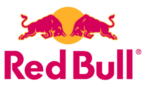
80. Red Bull
This famous energy drink was created in 1987 by entrepreneur Mateschitz. Its logo entails two red bulls butting heads in front of a yellow spot, which symbolises the sun.
79. Netflix
Its current logo was debuted simultaneously with a new website in 2014. Its customized typeface was created on two fonts: Gotham Bold and Gotham Book. Its streaming services opted for a red and white colour combination.
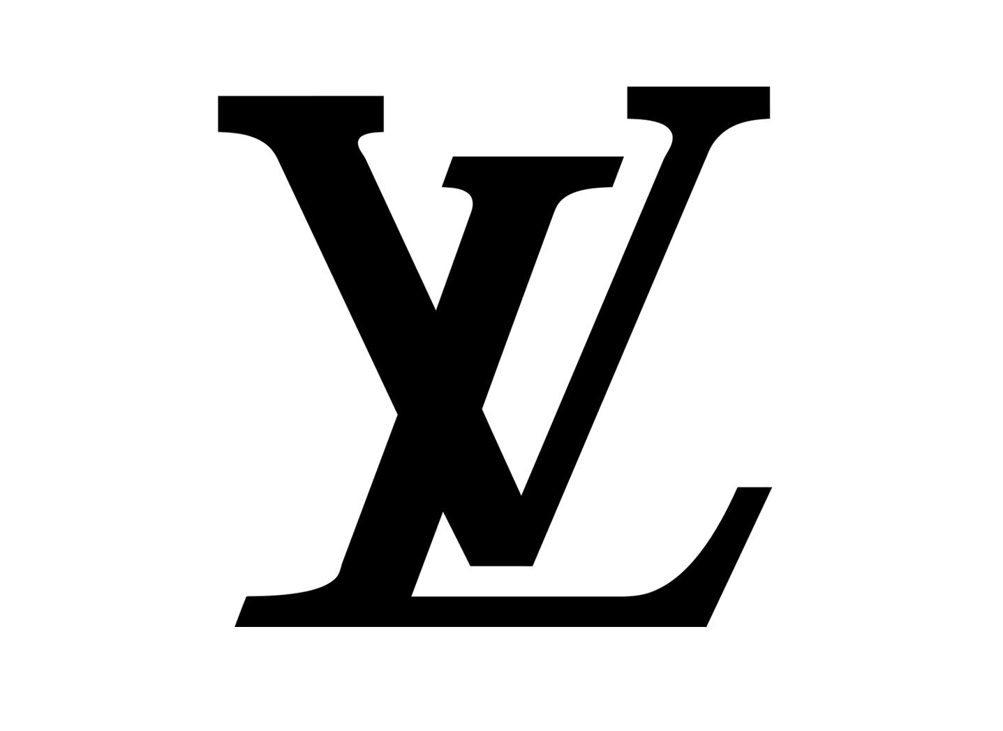
78. Louis Vuitton
Its logo symbol reminds of the company’s founder. The `L` and the `V` are interlocked in an intricate fashion. Its logo is executed in two main styles. One is the whole brand's name which is usually under the monogram in uppercase. The LV uses straight `V` with an overlapped italicised `L`.
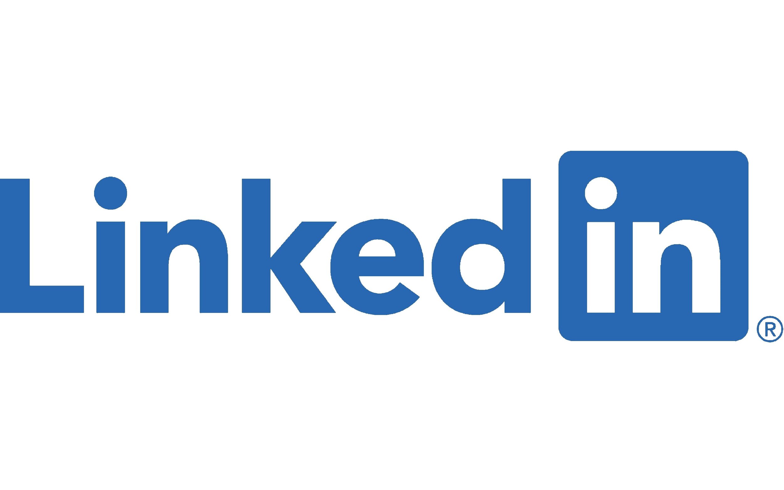
77. LinkedIn
The company’s logo has the word `Linked` coloured in blue shade and the word `in` inscribed in a blue square with round angles. This logo represents the professionalism, seriousness, and reliability of the company.
76. Reddit
The logo of the company is also called Snoo. It has different elements such as an antenna, which makes Snoo an alien capable of travelling in time and space. It has no gender and its eyes are red, which makes it stand out among other alien logos.
75. Lego
This is a famous toy manufacturer which was established in 1932. In the logo, the letters are all in the capital and are placed closer to one another.
74. Lamborghini
Lamborghini was introduced in 1963. Its logo depicts a golden bull on a black crest with a golden outline and elegant sans serif lettering above the bull's head.
73. Kodak
The company’s current logo was designed by the Identity design agency and has two `K`s with their vertical bars straight and angular while the rest of the letters featured round and smooth bottom parts.
72. Jaguar
The company’s logo depicts a leaping jaguar with a snarl on its face. It was initially introduced as a hood ornament but is now on a badge in silver, metallic grey, and black.

71. Hilton
The Hilton hotels and resorts is a chain of international hotels that have existed for more than 90 years. The logo has gone through several shifts from its original design to a darker palette, soft and elegant serif typeface.

70. Tommy Hilfiger
The palette of this logo has managed to remain consistent over time since its introduction in 1985. However, notable changes are with the colours where the original version of the logo was with white letters, while the current is in blue.
69. Harley Davidson
The company is a legendary brand of one of the most celebrated motorcycles in the world. Its logo has undergone numerous changes since the inception of the company in 1903. Today, the brand uses a monochrome colour palette with bright orange in frames, and `Motorcycles` lettering placed over and below the wordmark.

68. Gucci
The double G symbol of the company was created by Also Gucci, son of the company’s founder Guccio Gucci, in the 1930s. it consists of two interlocking letters in a modern sans serif typeface.

67. Ferrari
This car brand is highly associated with wealth and prosperity. Its logo depicts a reared horse. This iconic symbol was originally designed in the 1920s. Today, the main symbol is a horse on its hind legs. The colour on the logo is black, for the horse and yellow background.

66. Exxon Mobil
Exxon Mobil logo depicts vibrant colours, symbolizing energy. It also promotes reliability as shown by the cross in the two `X`.
65. AT&T
This company’s logo is flat and has the capitalization of the letters AT&T. the colour palette has light blue as the main colour. The company’s symbol is a 3D image of the globe.
64. Android
The company’s logo was designed in 2007 by Irina Blok, a graphic designer of Google. Its logo is a robot that has a quadrangular torso, a semi-circular head with two antennas, and bars with round ends for limbs. Its colour is `Android Green`.
63. HP
The company’s logo combines the names of its founder, Hewlett Packard. It has a blue colour which symbolizes excellence and white colour prompts grace.
62. Formula 1
Its logo was completely redesigned in 2018. It is composed of a bright red stylised `F` learning forward, and the diagonal line of `1`. It looks powerful and modern.

61. Mobil
The company's logo stresses its strength in its service through the use of vibrant colours. The blue spells security whiles the red in the letter `O` depicts strength.

60. Domino’s
The logo has three dots each representing its first 3 locations when the emblem was created in 1965. The light blue `Domino`s` wordmark is on the right from a diagonally located red and blue rectangular emblem with the three dots, two in a blue part, and one on the red.
59. NBC
The logo is bright with six vibrant colours, each symbolising the company’s six divisions. A peacock in white is facing to the front.
58. Audi
The company was formed after four companies came together, Audi, Horch, DKW, and Wanderer. Each of the four circles in the logo represents each partner.

57. BBC
This is the world’s oldest and largest broadcasting channel. Today, the company uses the logo which was designed by Martin Lambie Nairn in 1997. The news logo has the company’s name, each letter inside a square box, and uppercase `news` underneath. The name is in white with a red background.

56. Mastercard
The logo has a unique combination of red and yellow colours. The red colour indicates courage and passion whereas the yellow hints at prosperity.

55. Rolex
Its iconic logo has been with the company for a decade with little or no amendments to its shape and proportions, except for very minor ones. The brand uses a bright forest green for its logotype, written in a serif typeface.
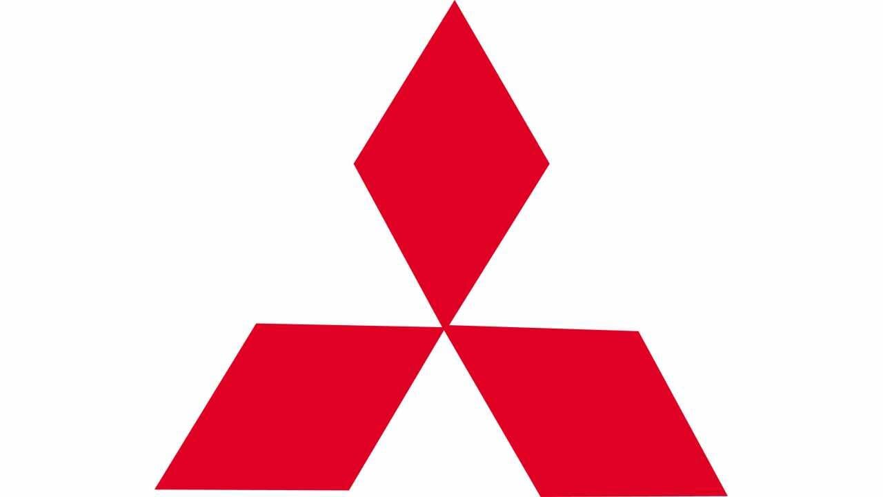
54. Mitsubishi
The logo encompasses 3 diamonds, representing reliability, success, and integrity.
53. Sony
Its logo design found its meaning with the Latin origin of its name. The word means sound and it depicts communicating strength in a simple way.

52. P&G
The logo features a minimalistic serif type. Both the letters are capitals and are italicised.
51. Under Armour
Founded in 1996 in the USA, Under Armor is one of the youngest famous American sports brands.
50. BMW
The company was established in 1913, and initially, it was specializing in aircrafts engine production. It changed its name from RAPP Motorrenwerke to Bayerische Motoren Werke, or simply BMW in 1916. Today, the company went minimalist on its logo and drew it in 2D. The circle with blue and white checkers has a thin grey outline and a thick white frame, where a grey `BMW` inscription extends.

49. Nissan
The company’s logo has undergone several changes but maintained its Nissan name and elements such as the rectangular block and outline circle. Today, the logo is 3D, with a sharp and flat text and design.

48. Verizon
The logo shows a strong colour combination of red and black. The red checkmark represents the company’s commitment to excellence.
47. Lacoste
The logo has seen several changes and today’s logo has a smaller crocodile, with an enlarged inscription. The lettering became thinner and with straight distinct cuts. Generally, the crocodile is green with white dots and a red mouth.
46. Mazda
The Mazda logo has a stretched `M` that looks like a pair of wings. It is owl-like and spells a futuristic attitude and goal-oriented feature of the company.

45. Colgate
The company’s logo has a combination of red and white colours. The red symbolizes dynamism while the white signifies sincerity.

44. Volkswagen
The company’s logo comprises of its initials, `V` and a `W`. Both letters interact superbly with one another. The blue colour stands for excellence, reliability, and class whereas the white colour symbolizes nobility, purity, and charm.

43. BP
The company’s current logo has a flower shape in bright shades of green and yellow. The lettering `BP` is in lowercase and at the top right corner.
42. Tesco
Its logo uses blue and red colours to depict prosperity. The colours are from the British flag, where the company was initially operated from.

41. Adidas
The company has four logos. The stripe on the trefoil logo symbolizes the company’s dedication to variety. The trefoil leaves stand for the 3 parts of the world, namely: North America, Europe, and Asia where its products are sold and the mountain-shaped logo conveys the concept of overcoming challenges and pursuing one's goals. Lastly, the round emblem stands for the globe and adaptations to changes.
40. Samsung
The word Samsung means 3 stars. The logo has a dark shade of blue color while its wordmark has a customized typeface. It has a distinctive feature in its letter `A` which has no horizontal bar.
39. Honda
The logo uses the capital letter `H` to depict confidence and durability. It was named after its founder Soichiro Honda.
38. Ford
The logo is oval-shaped to depict reliability and affordability. It was named after its founder Henry Ford and has the logo has the `F` and `d` in style.

37. World Wildlife Fund
Today’s logo has lettering `WWF` in bold and modern round sans serif typeface. It features the WWF acronym below the Panda. The colour choice is black and white.

36. GAP
The company has redesigned its logo seriously over time. Today, the logo has a monochrome combination, with black lettering on a white background. The letters are spaced out from each other, hence adding sophistication and light feeling.

35. UPS
The logo uses lowercase letters and is easily recognisable due to the unusual shape of the `u` character. Throughout its existence, the company has stayed loyal to its colour palette. It has a brownish and gold shade on its logo.
34. 3M
The logo has a 3 and M which overlap.

33. Visa
The new logo has smooth iconic lettering in dark gradient blue, almost close to purple shades.
32. IBM
Its logo symbolises progressive growth in the field of graphic design. In 2018, the company decided to reintroduce its original full logo, which was created in 1956. Today, it has a white `IBM` inscription on a dark grey horizontally-oriented rectangle.

31. Paypal
The company has always preferred blue, with some modification on its shades. It has a clean, round san serif type.
30. Sky
The logo has `News` lettering written in lowercase and use a lightweight sans serif typeface. Its colour palette has a red, black, and white combination.
29. Malboro
Its logo was designed in 1932 and has barely changed. A black inscription is a title case is placed on a white background with a red geometric figure on top.
28. Toyota
The logo is oval-shaped (in fact, it consists of 3 ovals) and has changed considerably over time. In 2020, the brand decided to keep the symbol as the logo element. Its official colour palette of the logo is monochrome, and the symbol is seen in white against an intense background.
27. Skype
Originally launched in 2003 with a red logo with a gradient wordmark, a new icon was unveiled in 2019, with the Skype name disappearing.

26. Alibaba
Alibaba The Chinese e-commerce giant operates in more than 200 countries. As of 2020, this is the only logo iteration since the company’s inception in 1999.

25. YouTube
The large video streaming service owned by Google has evolved little in regards to its logo design from its first iteration in 2005. The most significant change happened with the design of the current logo in 2017 with the wordmark in black and a slightly modified typeface.
24. Wikipedia
The logo we see today from Wikipedia involved supplementing the previous logo design at the bottom with two-line inscriptions – “Wikipedia” and “The Free Encyclopedia”. The content of the puzzles has remained almost the same.

23. Subway
The logo for the large restaurant chain has not changed drastically since its creation in 1965. This logo makes use of dark greens to convey the idea of freshness as well as bright yellows to convey positivity and flavour of the food.

22. KFC
Founded by Colonel Sanders in 1930, KFC is the most famous chicken fast-food restaurants in the world. The logo KFC use today became in existence in 2018 and after a rebrand. The d the shape of the logo was changed to trapezoidal and the portrait of colonel sanders was improved.
21. Shell
The first Shell logo appeared in the early 1900s but over time has moved from a pecten or scallop shell to today’s simplified shape with the two distinct colours of red and yellow.

20. Target
The name of the company dictated the logo choice. This is how a red bull’s eye became the symbol of the massive US retailer.
19. Dell
The first Dell logo was created in 1984 and featured the company name in a simple serif font. After a merger in 2016 with EMC Corporation, the company revamped the logo creating thinner letters but proportions saying the same with the new logo.
18. Beats
The company was founded by music icon Dr Dre in 2006 and the company was acquired by Apple in 2014. The Beats logo is unique, modern clean and creative. It’s a sophisticated symbol that captures the essence of the brand with ease.

17. eBay
In 2012 the latest eBay logo was created with a new look as a balanced reflection between eBay’s colourful history and the company’s vision toward a “cleaner” and “more contemporary and consistent experience.”

16. FedEx
Established back in 1971, FedEx has now become the industry leader globally and most recognisable brand for its delivery services. In 1994 the simple buy yet effective "FedEx" logo was created after shortening the name from "Federal Express".
15. Mercedes Benz
This iconic car logo consists of a simple depiction of a three-pointed star that represents its domination of the land, sea, and air.
14. Walmart
In 2008 the giant retailer underwent the biggest logo change of its history, introducing a new font and iconic spark.

13. Twitter
The first Twitter logo was created back in 2006. It has grown to be the top 10 visited website in the world in 2020. The bird icon replaced the brand name in 2012 and is synonymous with the 140 character company
12. Olympics
The rings are five interconnecting rings, coloured blue, yellow, black, green and red on a white field. It was designed by Coubertin in 1913. The five continents of Europe, Asia, Africa, America, and Oceania are represented by each of the five rings.
11. Disney
Disney is the most well-known brand in entertainment and is steeped in history from the time of its inception in 1923. The logo we see today was adopted in 2006 displaying the grandeur of Cinderella’s castle.
10. Facebook
Launched in 2004 the company had the name "The Facebook", it was changed to "Facebook" in 2005. The logo has gone through only a few modifications continuing with its rectangular shape and the classic blue colour. Facebook is the largest social media site in the world and looks to maintain that status well into the next decade.
9. Amazon
One of the biggest success stories on this list over the last decade, Amazon grew from humble beginnings. Starting as an online book shop in 1994 to become the biggest online retailer in 2021. The logo Amazon used today was created in 2012 and contains the famous smile which is to reflect the smile their customers' service brings.
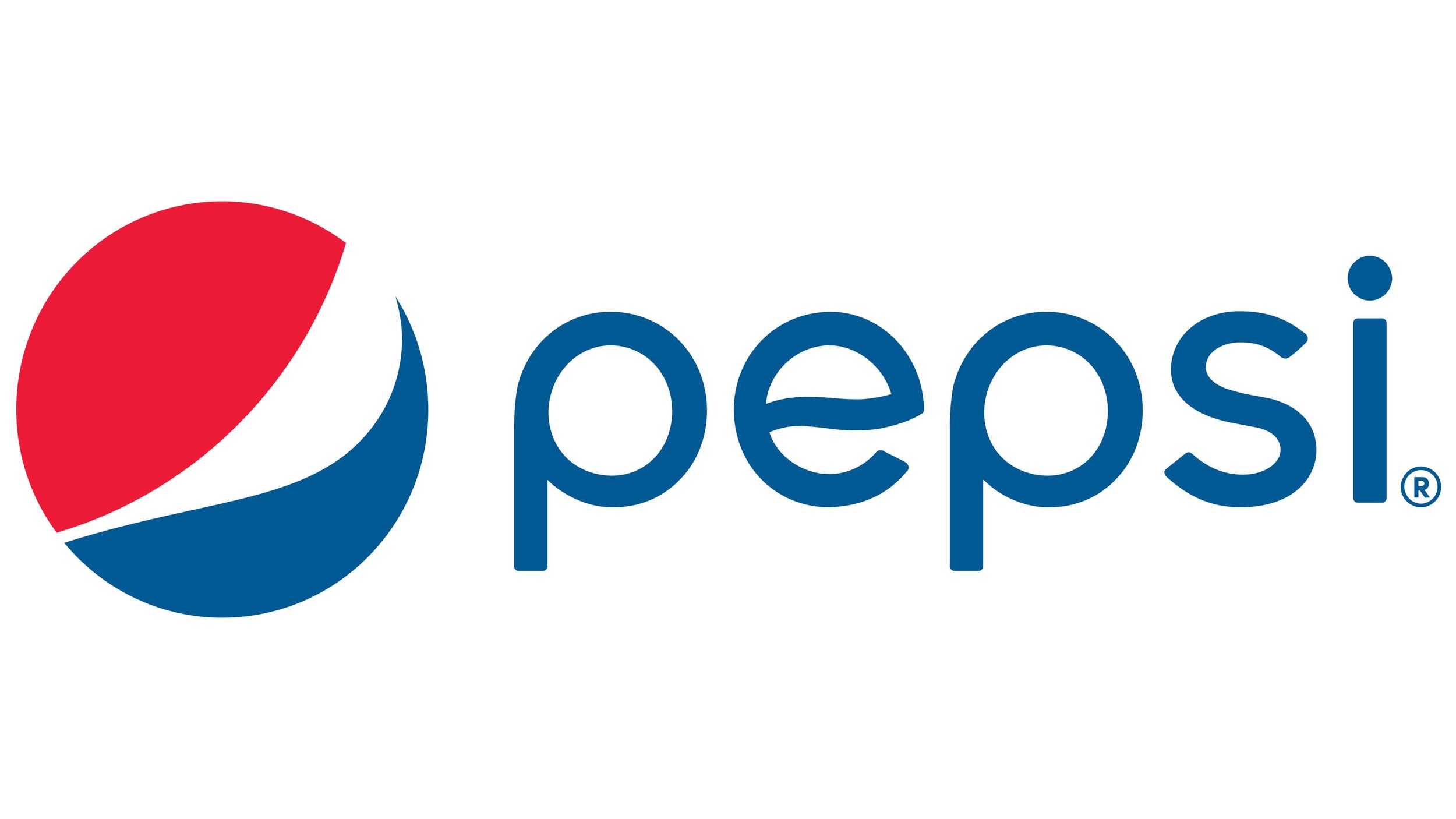
8. Pepsi
Over 123 years, the Pepsi logo has undergone 12 iterations with the latest occurring in 2008 at a cost of 1 million dollars.
7. Apple
The first logo was created by one of the co-founders of Apple Ronald Wayne in 1976. The original did not have the apple but instead was representing the law of gravity that is inspired by an ap with an image of Isaac Newton. Today, the company uses a modernised minimalist flat Apple logo. The logo comes in 3 colours; silver, white and black.

6. Starbucks
The largest coffee chain in the world started with its first logo iteration in 1971 and have undergone some of the most well-known brand redesigns. The current logo used came about in 2011 with Starbucks introducing a new logo going back to the original green success they had used previously.
5. McDonald's
The iconic McDonalds Golden Arches logo ranks highly on our list. With over 3600 restaurants in over 100 countries, this logo can be seen in most major cities in the world.
4. Microsoft
Microsoft's two founders, Bill Gates and Paul Allen created the company's first logo. It consisted of the company's name in a sans serif font and represents the decade of the pretty years well. A major revamp of Microsoft's logo took place in 2012 and it the current logo that is used today.
3. Nike
When Nike changed its name on May 30, 1971, the company started using the Swoosh as its official logo the same year.
2. Google
Google is likely to become the most famous and recognisable logo over the next decade. The Google logo appears in numerous settings to identify the search engine company.
Coca-Cola
Coca-Cola logo and brand is the most recognisable in the world. The red and white Coca-Cola logo is recognised by 94% of the world's population.
The importance of a logo design can’t be understated as is shown from this list of most famous logos.
Contact us today if you looking for a Logo Design Ireland.